
This code creates a Circle Loader Animation using CSS. It displays a spinning circular loader on a web page. The loader is designed for visual appeal and can be used to indicate background processes or loading times on websites.
It enhances user experience by providing a visually engaging and informative loading animation. You can use this loader animation code in your website’s loading screens, forms, or any page element that requires a loading indicator.
How to Create Circle Loader Animation CSS
1. First of all, load the Normalize CSS by adding the following CDN link into the head tag of your webpage.
<link rel="stylesheet" href="https://cdnjs.cloudflare.com/ajax/libs/normalize/5.0.0/normalize.min.css">
2. Create the HTML structure for the loader. The following code snippet creates a <div> element with a class of “loader,” which we will style with CSS.
<div class="loader"></div>
2. Now, add the following CSS code to your website’s CSS file or within a <style> tag in your HTML document.
@property --nose {
  syntax: "<percentage>";
  initial-value: 0%;
  inherits: true;
}

@property --tail {
  syntax: "<percentage>";
  initial-value: 0%;
  inherits: true;
}

:root {
  --size: 25;
}
body {
  display: grid;
  place-items: center;
  min-height: 100vh;
  background: hsl(0, 0%, 8%);
}

.loader {
  height: calc(var(--size) * 1vmin);
  width: calc(var(--size) * 1vmin);
  position: relative;
  border-style: solid;
  border-width: 5vmin;
  border-color: transparent;
  border-radius: 50%;
  -webkit-mask: conic-gradient(
    from 45deg,
    transparent 0 var(--tail),
    white 0 var(--nose),
    transparent 0
  );
          mask: conic-gradient(
    from 45deg,
    transparent 0 var(--tail),
    white 0 var(--nose),
    transparent 0
  );
  -webkit-animation: load 2.5s both infinite ease-in-out, spin 3.25s infinite linear;
          animation: load 2.5s both infinite ease-in-out, spin 3.25s infinite linear;
}

.loader::after {
  content: "";
  position: absolute;
  inset: -5vmin;
  background: conic-gradient(
      from 95deg in hsl longer hue,
      hsl(240deg 100% 75%),
      hsl(240deg 100% 75%)
    ) -5vmin -5vmin / calc(100% + 10vmin) calc(100% + 10vmin);
  background: goldenrod;
  border-style: solid;
  border-width: 5vmin;
  border-color: transparent;
  border-radius: 50%;
  -webkit-mask: linear-gradient(white 0 0) padding-box,
    linear-gradient(white 0 0);
  -webkit-mask-composite: xor;
          mask: linear-gradient(white 0 0) padding-box exclude,
    linear-gradient(white 0 0);
}

@-webkit-keyframes spin {
  to {
    transform: rotate(360deg);
  }
}

@keyframes spin {
  to {
    transform: rotate(360deg);
  }
}

@-webkit-keyframes load {
  0% {
    --tail: 0%;
    --nose: 0%;
  }
  40%,
  60% {
    --nose: 100%;
    --tail: 0%;
  }
  100% {
    --nose: 100%;
    --tail: 100%;
  }
}

@keyframes load {
  0% {
    --tail: 0%;
    --nose: 0%;
  }
  40%,
  60% {
    --nose: 100%;
    --tail: 0%;
  }
  100% {
    --nose: 100%;
    --tail: 100%;
  }
}

@supports (background: conic-gradient(from 95deg in hsl longer hue, red, red)) {
  .loader::after {
    background: conic-gradient(
        from 95deg in hsl longer hue,
        hsl(240deg 100% 75%),
        hsl(240deg 100% 75%)
      ) -5vmin -5vmin / calc(100% + 10vmin) calc(100% + 10vmin);
  }
}
4. To activate the loader, you need to trigger it when your website is loading content or performing background tasks. This can be done using JavaScript or other scripting methods.
// JavaScript to show the loader when content is loading
function showLoader() {
  document.querySelector('.loader').style.display = 'block';
}

// JavaScript to hide the loader when content is loaded
function hideLoader() {
  document.querySelector('.loader').style.display = 'none';
}
That’s all! hopefully, you have successfully created a loader animation. If you have any questions or suggestions, feel free to comment below.
Similar Code Snippets:
![Responsive Horizontal Timeline with jQuery & CSS3]()
Responsive Horizontal Timeline with jQuery & CSS3
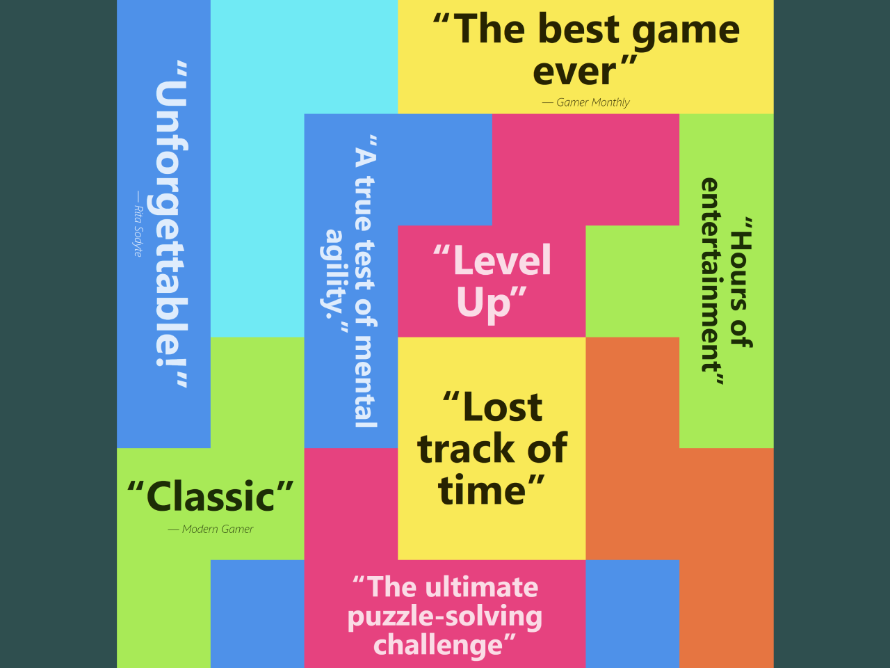
![Testimonial Quotes Cloud in HTML CSS]()
Testimonial Quotes Cloud in HTML CSS
![Content Placeholder Animation Using CSS]()
Content Placeholder Animation Using CSS
![CSS Background Texture without Image]()
10+ CSS Background Texture without Image
![Social Icons with Circular Profile Pic in CSS]()
Social Icons with Circular Profile Pic in CSS
![Image and Text Side By Side HTML CSS]()
Image and Text Side By Side HTML CSS
![Floating Bottle on Water CSS Animation]()
Floating Bottle on Water CSS Animation
![Image Shapes in CSS with Example]()
6+ Image Shapes in CSS with Example
![Scroll-driven Animations in Pure CSS]()
Scroll-driven Animations in Pure CSS


I code and create web elements for amazing people around the world. I like work with new people. New people new Experiences.
I truly enjoy what I’m doing, which makes me more passionate about web development and coding. I am always ready to do challenging tasks whether it is about creating a custom CMS from scratch or customizing an existing system.